
← Our Causes
Cultural Preservation Project
Documenting and preserving our cultural heritage — language, traditions, and oral history — for future generations.
Why Most AI-Generated Admin Panels Fall Apart
The core problem is context. When you send a single vague message asking for "a complete admin panel," you force the AI to make hundreds of design decisions simultaneously without system instructions to guide it.
The Four Root Causes of Broken AI Panels
Generic requests produce generic results. AI models default to training-data averages when your prompt lacks specifics. You get a gray sidebar with random navigation names, a dashboard with five identical cards, and forms that ignore validation entirely.
Missing context means missing intent. Without defining your target audience, data types, or user roles, the AI fills gaps with assumptions. Those assumptions rarely match your actual business logic or the people who will use the system daily.
No prompt hierarchy means no visual hierarchy. When everything is requested at once, the AI cannot prioritize what users see first. Your metric cards compete with your sidebar, and your search bar hides behind an oversized header.
Designers think in sections, not monoliths. Professional admin UI follows a predictable architecture: sidebar, header, main content area, and detail panels. The AI responds better when your prompts mirror this mental model.
Writing effective system instructions for each panel component eliminates guesswork and gives the AI a clear assignment rather than an open-ended question.
What Good Admin Panel Prompts Actually Do
A well-structured prompt does three things: it constrains the design space, defines the data model, and specifies the interaction behavior. When all three are present, the AI stops guessing and starts executing.
The difference shows up immediately. A prompt that says "build a users table" produces a generic grid. In contrast, a prompt that says "build a users data table with sortable columns, a combined avatar-name-email cell, role badges in three colors, and pagination showing 1 to 10 of 847 users" produces something you can actually ship.
image - 2026-08-24T104021.245.png
How to Structure Prompts for Each Panel Section
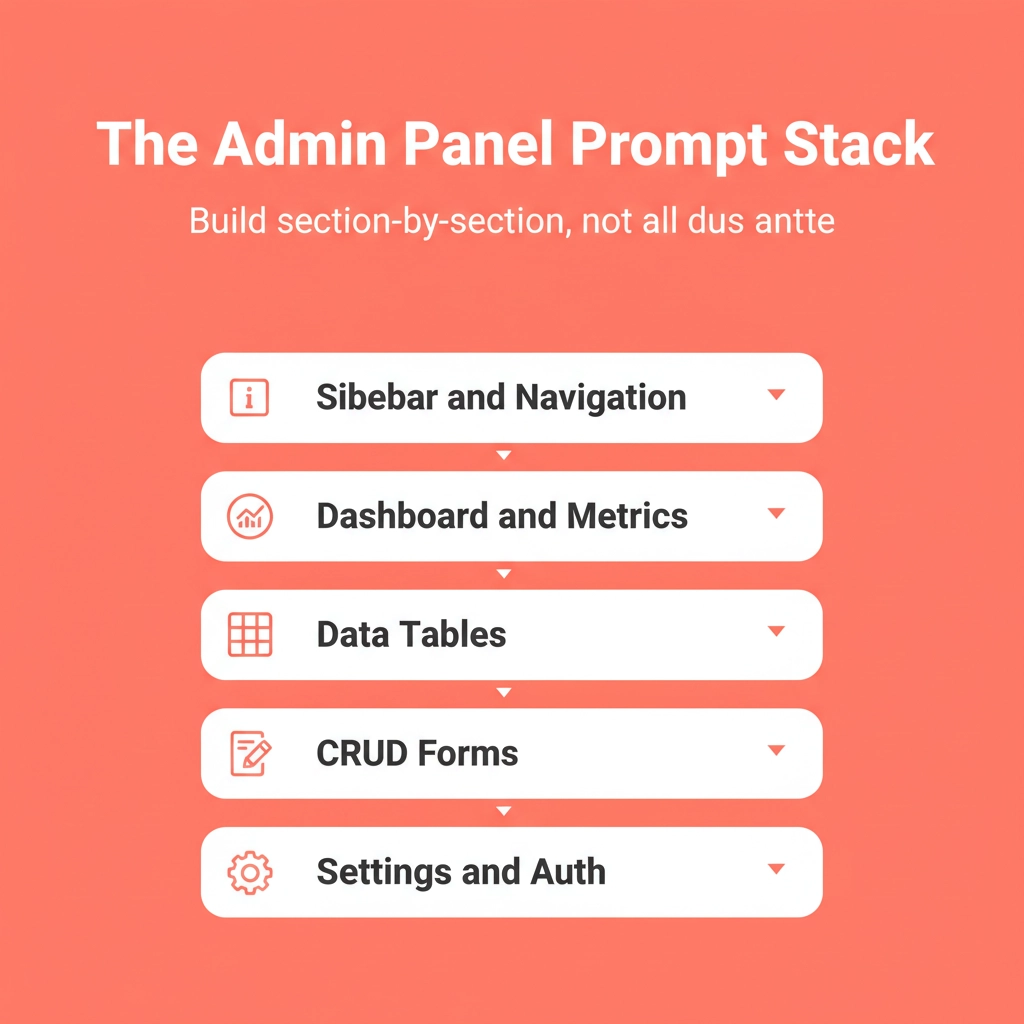
Every production admin panel shares the same core architecture. Breaking your prompt into these five sections creates consistent spacing, visual consistency, and navigation patterns that users expect from modern software.
Panel Section Key Prompt Details AI Success Rate
Sidebar navigation Fixed width, icon library, nav names, mobile behavior 90%+
Dashboard cards Real numbers, trend indicators, grid layout 95%+
Data tables Column types, pagination, empty state, loading states 85%+
CRUD forms All four operations together, validation rules, modal behavior 80%+
Settings tabs Tab names, field types per section, grouping logic 75%+
You can generate a full-stack app from a single prompt when each section follows this structured approach.
The Prompt Stack Principle
Think of your admin panel build as a stack, not a single request. Each prompt builds on the previous output. The sidebar establishes the shell, the dashboard fills the main content area, and tables and forms come after the layout is locked.
This sequencing matters because the AI uses prior context to make decisions. For example, a sidebar prompt that specifies a slate-900 background and indigo-500 active states gives the dashboard prompt a color system to work from. Skip the sequence and you get visual inconsistency across sections.
Prompts 1 to 5: Sidebar and Navigation
The sidebar defines your entire panel structure. Get it wrong, and every other component feels disconnected.
Prompt 1: Fixed Sidebar Shell
Build a fixed left sidebar (250px width, slate-900 background, white text). Include a logo area at the top, navigation sections for Dashboard, Users, Products, Orders, Analytics, and Settings. Each nav item gets a lucide-react icon. Add an active state with indigo-500 accent highlight. Collapsible hamburger menu on mobile. React + TypeScript + Tailwind CSS.
Why this works: The width, color, icon library, and active state are all specified. As a result, the AI has no design decisions left to make, only implementation decisions.
Prompt 2: Nested Navigation with Sub-Items
Add nested sub-navigation to the sidebar Users section. When Users is clicked, expand to show: All Users, Roles and Permissions, Invitations. Indent sub-items with a left border accent. Collapse other sections when one expands. Keep the active page highlighted even inside nested groups.
Why this works: Accordion behavior and active state persistence are explicitly defined. Without this, the AI defaults to always-expanded navigation that clutters the sidebar.
Prompt 3: User Profile Dropdown
Add a user profile section at the bottom of the sidebar. Show avatar (40px circle), display name, and role badge. On click, open a dropdown with: My Profile, Account Settings, Notification Preferences, and Log Out (red text). Dropdown closes on outside click.
Prompt 4: Sidebar with Notification Badges
Add notification badges to the sidebar nav items. Orders shows a red circle with count ("12"), Messages shows an unread dot (blue), and Settings shows an orange warning icon when action is required. Badges update without page reload. Use subtle animation on count change.
Prompt 5: Breadcrumb Header Bar
Create a top header bar (64px height, white background, bottom border). Include breadcrumb navigation showing current path (Home, Users, All Users), a global search bar with keyboard shortcut hint (Cmd+K), notification bell icon with unread count, and the user avatar from the sidebar profile section.
Your sidebar is the foundation of your entire panel. Skip the manual stitching and let Rocket generate the full sidebar shell, navigation structure, and header bar in one go. Start building on Rocket and have your panel structure live in minutes.